Noblis Team - Centrifuge
VAST 2010
Challenge
Hospitalization
Records - Characterization of Pandemic Spread
Authors and Affiliations:
David C. Roberts, PhD, MPH,
Noblis, Team
Lead, droberts@noblis.org
Casey Henderson, Centrifuge Systems, chenderson@centrifugesystems.com
Peter Kuehl, MD, PhD, MedStar, peter.kuehl@medstar.net
Daniel Lucey, MD, Georgetown
University, drl23@georgetown.edu
Michael Pietrzak, MD, MedStar,
michael.pietrzak@medstar.net
Ben Pecheux, Noblis, benjamin.pecheux@noblis.org
Virginia Sielen, Noblis, virginia.sielen@noblis.org
Harry Cummins, Noblis, graphic artist, hcummins@noblis.org
Richard P. DiMassimo, Noblis, video
producer, rdimassimo@noblis.org
Austin Blanton, Noblis Intern, austin.blanton@noblis.org
Catherine Campbell, PhD, Noblis, catherine.campbell@noblis.org
[PRIMARY Contact]
Noblis VAST Webpage:http://www.noblis.org/VAST
Tools:
(1) PostgreSQL (http://www.postgresql.org) as the underlying database, with
phpPGAdmin/SQL for database administration and data manipulation.
(2) Microsoft Office 2007 (http://www.microsoft.com;
primarily Access and Excel) for ad-hoc queries and data visualization.
(3) GeoCommons Maker (http://maker.geocommons.com/)
for geographic visualization.
(4) Google Motion Chart (http://code.google.com/apis/visualization/documentation/gallery/motionchart.html)
for animated charting.
(5) Centrifuge (http://www.centrifugesystems.com),
a partner in this project, for exploratory data analysis and
visualization.
Video:
Noblis_Centrifuge_MC2.mp4
ANSWERS:
MC2.1: Analyze the
records you have been given to characterize the spread of the
disease. You should take into consideration symptoms of the
disease, mortality rates, temporal patterns of the onset, peak and
recovery of the disease. Health officials hope that whatever
tools are developed to analyze this data might be available for the
next epidemic outbreak. They are looking for visualization tools
that will save them analysis time so they can react quickly.
Initial Observations. Data
were provided for hospital admissions and deaths for 11 distinct
locations in 22 separate tables. These tables were imported into a
shared postgreSQL database, and concatenated and joined across patient
ID and location to provide a single unified table. (4 staff-hours
including DB admin) The data represent a total of 14,543,948 admissions
uniquely identified by patient ID and location, over the time period
4/16/09 to 6/29/09. Each admission is characterized by date, age,
gender, and syndrome (a text string listing of one or more symptoms).
Each death record provides a date of death for a patient ID. Of those
patients admitted, 357,469 died. Using directed SQL queries, we
determined that no patient was admitted more than once, and each death
is associated with a single admission event. We frequently used
“group by date” queries throughout the study to see admit
and death rates as a function of date. This initial analysis task took
approximately 2 hours to complete.
Characterization of Disease. The data
were further analyzed using SQL queries and Centrifuge to parse and
summarize the syndromes. We identified 1310 distinct syndrome
descriptions, each identifying one or more symptoms. Viewing the
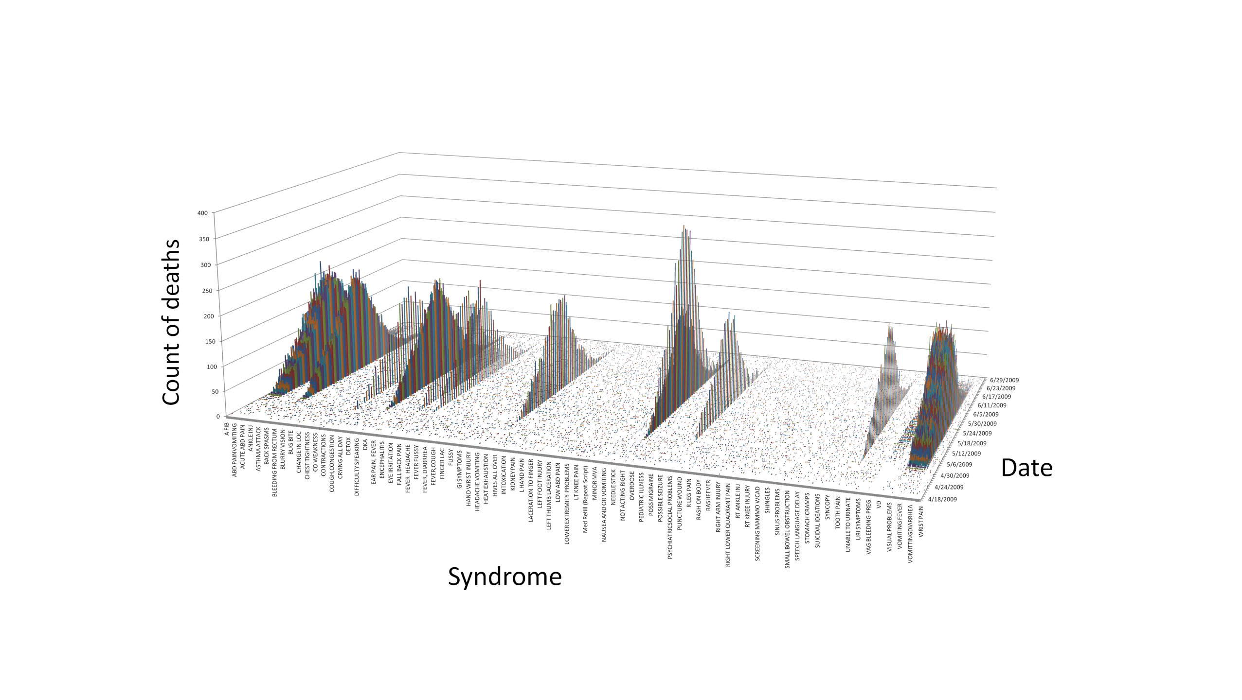
frequency of deaths by syndrome and date across the entire dataset
(Figure 2.1.1; note that all syndromes are shown but only a subset are
labeled), only 92 of the syndromes showed a large increase followed by
a decline, relative to apparent baseline rates, during the time period
covered by the data and in addition were associated with nearly all
deaths reported in those locations. Figure 2.1.1 illustrates
that, with one correctable exception (“nosebleeds”), these
syndromes are equally represented in the data. These syndromes were
designated as “outbreak-related”, and used in subsequent
analyses to identify and select only the outbreak-related cases. These
92 syndromes appeared not only during the apparent outbreak period but
also at a low frequency throughout the time domain of the data. Ad-hoc
database queries revealed that the overall case fatality rate for
patients with the outbreak-related disease was 9.87%, and that of the
357,469 deaths reported, only 11,438 (3.2 %) were not outbreak-related.
Figure 2.1.2, a Centrifuge stacked bar chart, shows the development and
spread of the disease, peaking nearly simultaneously over the span of
one week, but in differing magnitude, in 9 of the 11 locations as
expressed by outbreak-related deaths on a single timeline. Figure 2.1.3
depicts an animated GeoCommons geographic view of the disease that
illustrates the change in mortality over time in the 9 outbreak
locations. The hospital admission rates for outbreak related syndromes
showed frequency curves that mirror these death rate curves and
illustrations, and are not shown here. This characterization analysis
was completed in 8 hours.
 .
.
Figure 2.1.1. Deaths by Syndrome and Date
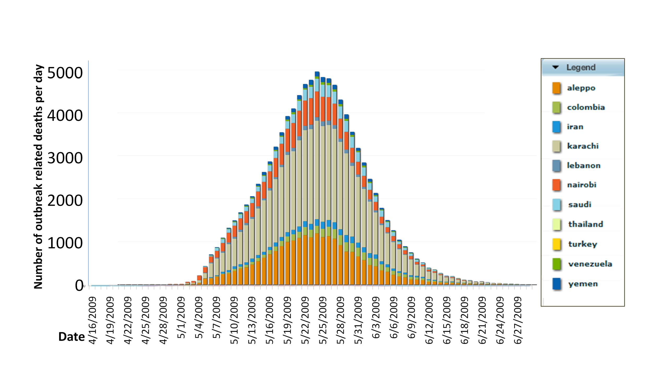
Figure 2.1.2. Outbreak-Related
Deaths by Date and Location
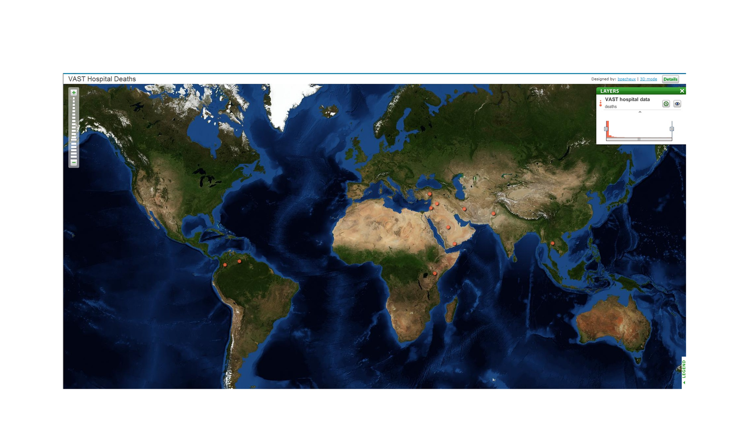
Figure 2.1.3. Screen Capture of
Animated GeoCommons
Geographic View of Mortality Timelines
Symptomatology.
On reviewing the 92 outbreak related syndromes, we saw that many
duplicate symptoms were listed therein. Because all 92 syndrome
descriptions were equally represented, frequency of occurrence of a
term in the 92 syndrome descriptions could be used to derive its
probability of occurrence in a patient with the disease. Manual parsing
and semantic analysis of the syndrome descriptions reduced them to 18
symptoms. Probabilities for the top 5 symptoms are provided in Figure
2.1.4; they sum to a value greater than 1 because some patients had
multiple symptoms. The relatively low probability of fever among
outbreak cases was noted as medically unusual, and the wide variety of
symptoms was interpreted as characteristic of a viral disease agent.
Ad-hoc queries revealed that the syndromes, and hence, symptoms,
associated with outbreak patients that died have the same relative
proportion in the data as those associated with survivors. In addition,
the distribution of syndromes, and hence symptoms, did not vary
significantly by location or date. This segment of analysis was
completed in 8 hours.
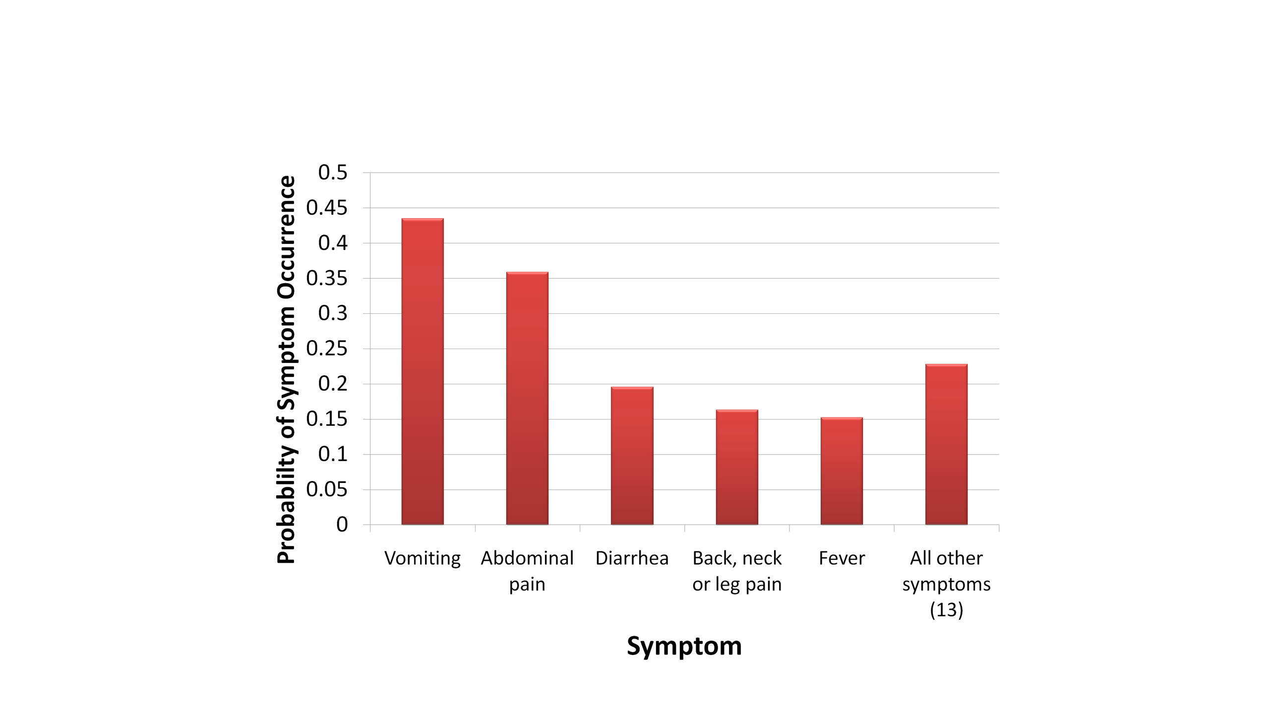
Figure 2.1.4. Probability of
Occurrence of Outbreak-Related Disease Symptoms
Age and Gender Effects. The
timelines for disease liftoff in all age groups track together for each
outbreak (average outbreak-related admit dates for each age group agree
within 3 days). The age distribution for outbreak related cases follows
general admission rates, but is proportionally higher for the youngest
and oldest age groups. There is no apparent difference among locations
for age distribution of the disease. No gender effects are observed for
any location or syndrome; male and femaie track together across all
locations and average admit dates agree. These results were compiled in
approximately 3 hours.
Saving time in the analytical process.
Several approaches used here saved time in the analysis; other tools
used here would allow rapid identification of an outbreak as it lifts
off from baseline to facilitate early intervention. A unified table
served by a fully functional remote database server provided high
performance for these large data sets. Centrifuge software was found to
be very useful for exploratory analysis, working seamlessly with the
remote database server and making extensive use of mouseover displays
of underlying attributes to allow rapid exploration of patterns within
the data. The drill chart feature of Centrifuge (see accompanying
video) allows exploration of underlying data for an item on one chart,
expanding it to a second chart displaying other variables (Setting up
Centrifuge used 4 staff-hours for setting up the system and
configuration and another 12 staff-hours for learning to use the tool).
The Microsoft Office suite was better suited to creating a final
presentation, where font size and other aspects could be easily
adjusted. Unless otherwise noted, visualizations were generated using
this suite of tools. A Microsoft Access front end to the database,
coupled to Excel, provided alternate and efficient means to query the
data and develop appropriate graphics, and facilitated implementation
of custom statistical functions such as CUSUM (see below) which could
be used in predictive analysis. GeoCommons and Google Motion Charts
were useful for visualizations and sharing information, but did not
directly connect to our database.
MC2.2:
Compare the outbreak across cities. Factors to consider include
timing of outbreaks, numbers of people infected and recovery ability of
the individual cities. Identify any anomalies you found.
Comparison of Outbreaks Across Cities.
Outbreaks of varying magnitude occurred in 9 of the 11 locations
represented in the data. All outbreaks occurred nearly simultaneously,
peaking within a 5 day period (see discussion of outbreak timing
below), and all followed a similar time course, with a smooth onset and
decline of cases. The nearly simultaneous nature of the outbreaks
suggests a common origin. The well-behaved decline in cases across all
locations is unusual for a transmissible illness, but could occur where
the disease is aggressively treated, a rigorous quarantine is imposed,
or the population has a high degree of residual immunity due to either
previous exposure of the population to either the disease itself or to
vaccinations.
Outbreak Timing. To determine the
exact timing of each outbreak, we applied a spreadsheet implementation
of the CUSUM function (Fricker RD, Hegler BL, Dunfee DA, Statist. Med.
2008, 27:3407-3429) that effectively compares an indicator function
such as admits or deaths for a given day to a running baseline derived
from previous values. In this case we used a 7-day running baseline.
CUSUM is used in disease surveillance systems as a way to detect an
outbreak just as it lifts off so that countermeasures can be initiated
quickly. The alert level can be adjusted to give a low false positive
rate, and the function can be run in reverse to indicate setdown--when
the outbreak is officially over. Using hospital admission rates as the
indicator, Figure 2.2.1 graphically compares the outbreaks observed in terms
of liftoff date (identified by CUSUM on admits with an alert level of
1000), peak date and magnitude (determined by inspection), and setdown
date (by reverse CUSUM, alert=0) across all 9 outbreak locations. If
viewed in real time, the first liftoff would occur in Karachi on
April 23, and by May 3 all outbreaks are identified. The Aleppo
outbreak peaks first on May 14, followed immediately by Karachi and
Nairobi. The remaining locations have all peaked by May 20. All
outbreaks are over by June 18. CUSUM was also used on the mortality
data for an alternative determination of key dates, although this is
not so useful as a leading indicator. The average duration of the
outbreaks—i.e. the average timespan between liftoff and
setdown--was 44.2 days (admits), 43.7 days (deaths), and 48.4 days
(from admits liftoff to deaths setdown). Recovery ability, as
determined by days from peak to setdown for CUSUM deaths, varied from
12 for Venezuela to 29 for Karachi, and appeared to correlate with
total number of cases. Figure 2.2.2 illustrates the CUSUM function
applied to mortality data. The cleaner mortality data allowed a nonzero
value to be interpreted as a liftoff. Deaths occurred, with very few
exceptions (discussed below under anomalies), exactly 8 days after
admission. This analysis was completed in approximately 18 hours.
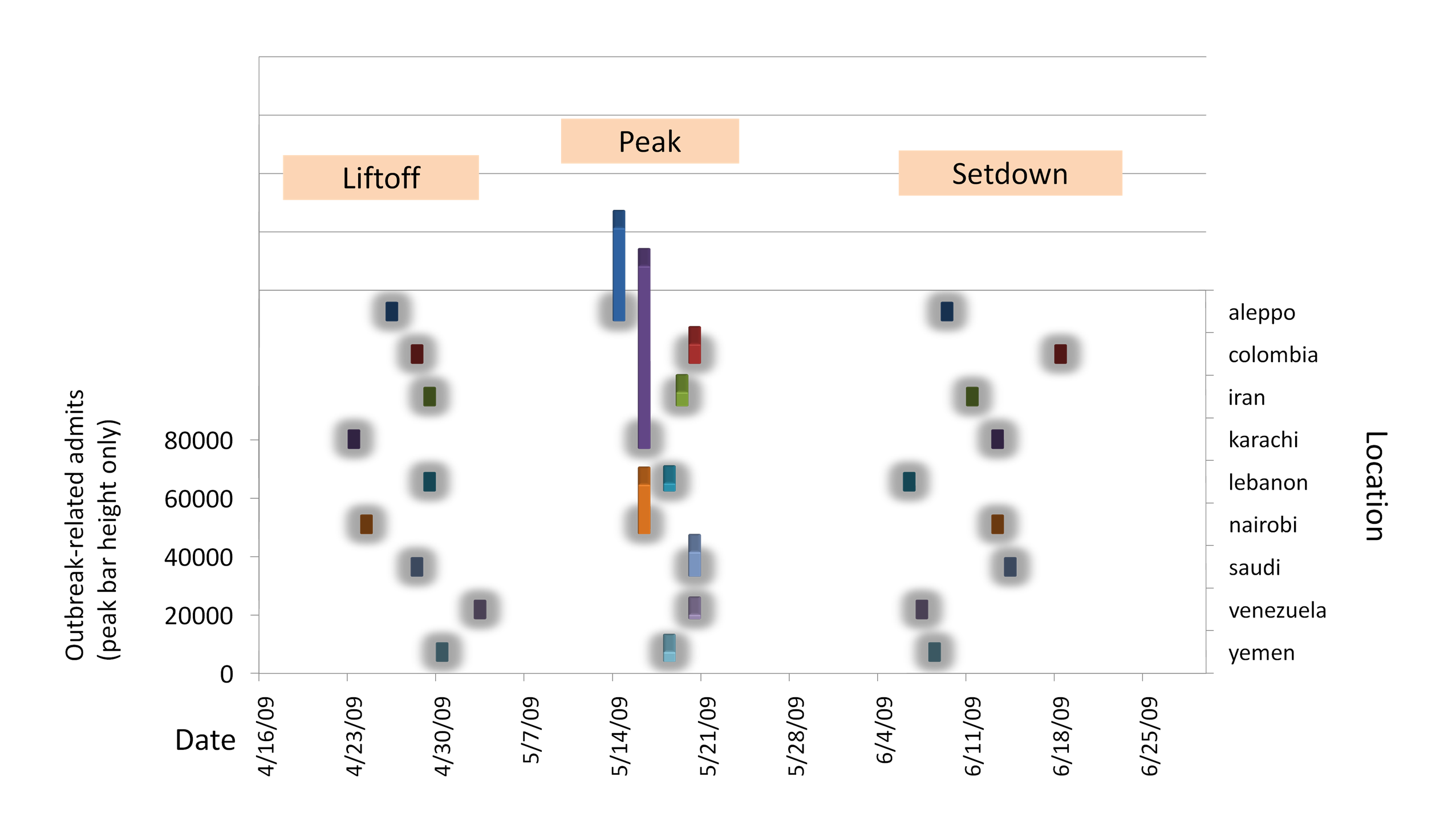
Figure 2.2.1. Detailed
Comparison of Outbreak Timing (Admits) Across Locations
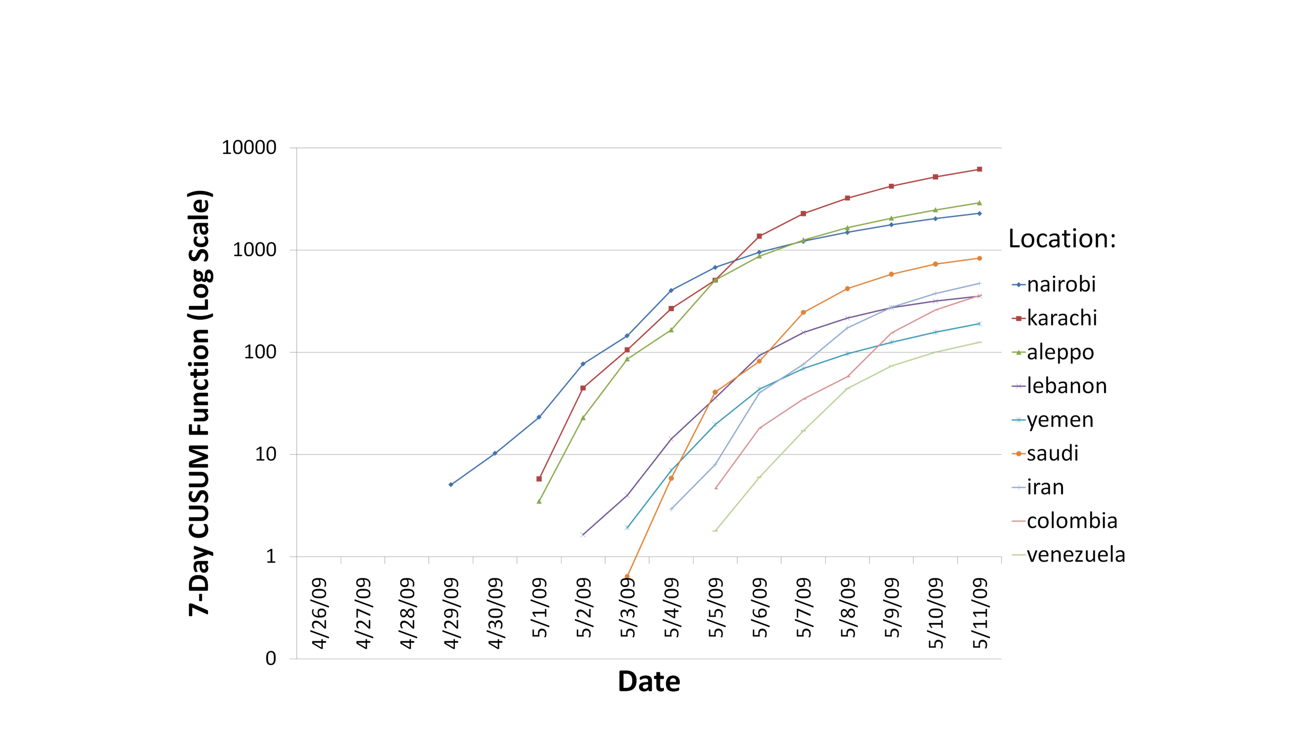
Figure 2.2.2. CUSUM Function
Applied to Deaths Data Across Outbreak Locations
Disease Severity. As shown in
Figure 2.2.3, the differences in the way the disease manifests itself
in the 9 locations can be seen by plotting the outbreaks by two
calculated attributes that can be taken as measures of disease
severity: mortality rates and relative prevalence. Mortality rates
(more properly, case fatality rates) are determined as the number of
outbreak-related deaths divided by number of outbreak-related
illnesses, and ranged from 10.9% and 10.8% for Aleppo and Nairobi, to
8.4 and 8.7% for Saudi and Lebanon outbreaks. In terms of absolute
magnitude, Aleppo and Nairobi outbreaks also had the highest relative
prevalence (calculated as number of outbreak related cases divided by
the number of non-outbreak cases for a given location as a relative
measure of the population). Another desirable measure of disease
severity, duration of symptoms, cannot be discerned from the available
data. Thailand and Turkey did not exhibit a discernible outbreak. These
calculations and visualizations were achieved in 8 hours.
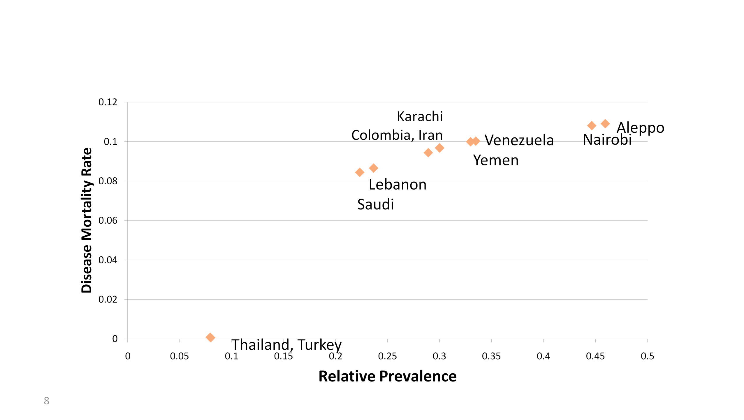
Figure 2.2.3. Disease Outbreaks per
Location Characterized by Mortality Rate and Relative Prevalence
Anomalies. In looking for
anomalies in the data, we took the approach that all the data were
potentially important, not just the data for the outbreak-related
syndromes and dates. Using Centrifuge to present each syndrome count
and date for a given location in a stacked bar (Figure 2.2.4; this is a
representation of the Nairobi data set in the form of a scrolling bar
chart with only a subset of syndromes visible in the window at any
time). In this chart, we could observe the prominence of the
outbreak-related syndromes, and irregularities in syndrome counts
(overall bar height)--those related to the reproductive system were
found to be abnormally underrepresented in all outbreak locations. The
chart also gives an example of a syndrome spike anomaly (an anomalously
high count-- more than 10 times greater than expected--of admits for
certain dates) as can be seen in the irregular color code for the date
bands for a given syndrome just to the right of the outbreak associated
bars. These are observed for various syndromes, dates, and locations
across the data set. Figure 2.2.5 illustrates a subset of the anomalies
we observed by location and date. None of these observed anomalies
occurs in more than one location, and each one is a spike on a single
day of a non-outbreak-related syndrome, which makes them unlikely to be
associated with the outbreak. The significance of these
spikes remains unknown. We further observed that all deaths occurred
exactly 8 days after admission, except for a small minority (3.1%) of
cases distributed normally between 2 and 7; if outbreak related
syndromes are excluded, there still remain a very small fraction
(0.23%) of these early deaths. Non-outbreak-related deaths did not
exhibit any special patterns indicative of an anomaly. These data set
analyses were completed in approximately 4 hours.
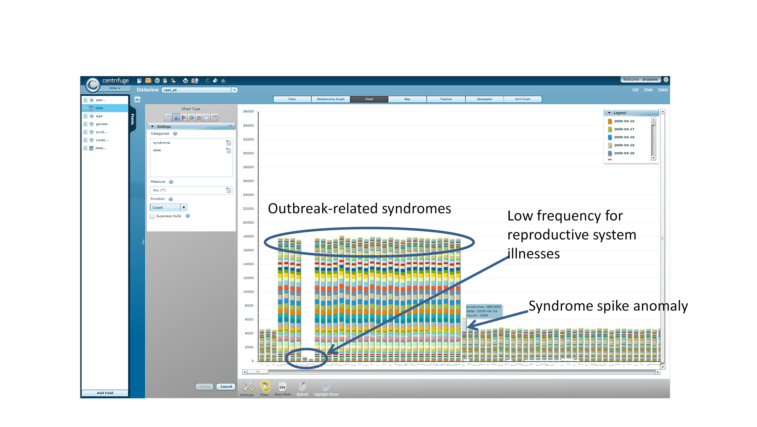
Figure 2.2.4. Use of Centrifuge to
Detect Anomalies (Nairobi example)
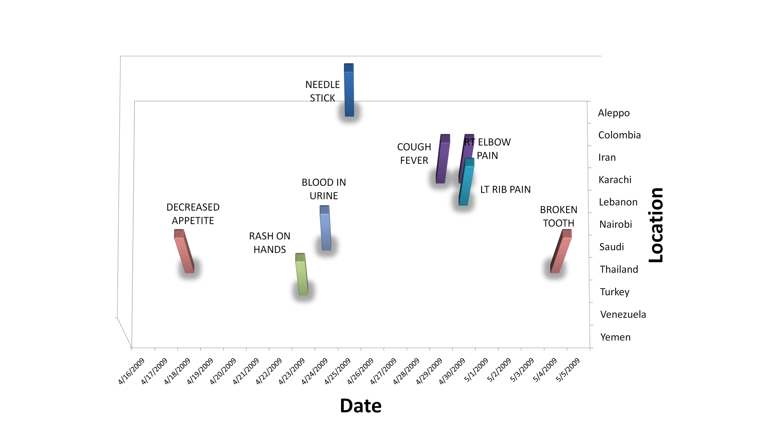
Figure 2.2.5. Summary of Syndrome
Spikes in Early Part of Timeline