Detailed Answer:
For this challenge, we used Microsoft Excel as our key visualization tool. Thus, we used a “budget visual analytics” methodology for this challenge. We made particular use of Excel’s macro capabilities, programming Excel to show us the evacuation patterns.
Methodology:
Transfer given text files to Microsoft Excel
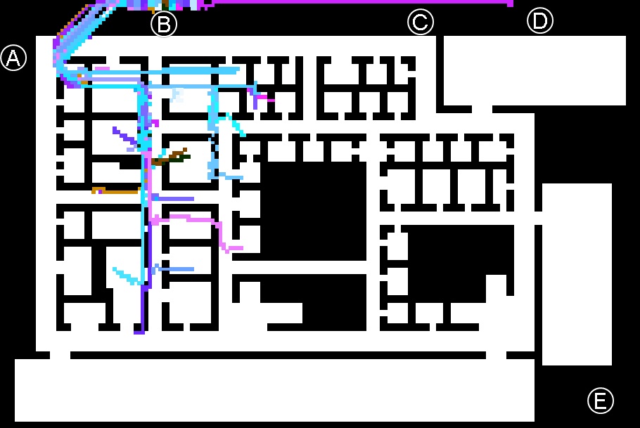
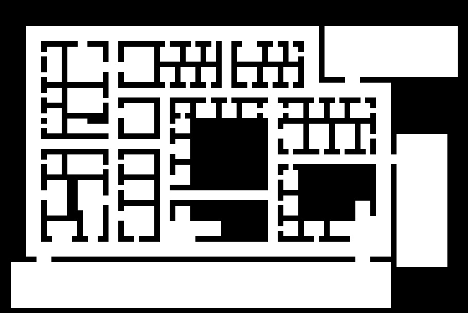
First, we moved our “binary” text file of the floorplan into Excel, using conditional formatting to get the floorplan on an Excel sheet with the walls/doors colored black and the open spaces white (Figure 1). We were able to see the building’s floorplan when we did so, which gave us the basic backdrop for the rest of our work on this mini-challenge.
At this time, we also shifted the RFID data into the more versatile Excel. This allowed us more freedom to manipulate the data: sorting by RFID tag, by time, or by location.
Each coordinate was rounded to the nearest half-number, in order to work with the Excel layout we were using. This decision did not appear to hinder our results in any way.
Figure 1. “Binary” floorplan in Excel
Write macros to build visualization
We then coded Visual Basic macros on Excel that would allow us to visualize the health building evacuation. These macros directed Excel to mark the location of each individual over time on the floorplan. By marking where each individual was at each time point, we were able to see each person’s path of travel over the given time period. Additionally, our macros were written to assign a unique color to each RFID’s path of travel.
Furthermore, we adjusted the code within our macros to show only selected individual’s paths of travel, or to show only selected time frames. This allowed us greater flexibility in looking at patterns of movement or at anomalous behavior in individuals or groups.
We were able to turn Excel into a pretty impressive visualization tool with our macros. We created an interface on a separate Excel sheet (within our floorplan Excel database) that held a database of “lists”—collections of RFID tags whose paths we wanted to run simultaneously—and coded the macros to run from these lists. This was helpful for characterizing patterns and groupings within the evacuation process. It also allowed us to run our suspects and casualties together, which helped us figure out where the bomb was placed. We added a “timer” to our floorplan, again coded with macros, to show 10-unit intervals on the screen as we ran the RFID data.
Examine patterns; Develop conclusions
We ran each of the 82 RFID tags’ path of travel individually, noticing patterns in exit behavior. We began to run combinations of RFID tags to visualize these behavior pattern groupings. We were able to determine the following about the evacuation process:
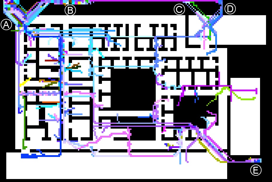
All of these patterns, together, are illustrated in Figure 2, a labeled screencap of an Excel run-through of all RFID travel paths for the entire time sequence.
|
|
Figure 2. All RFID paths
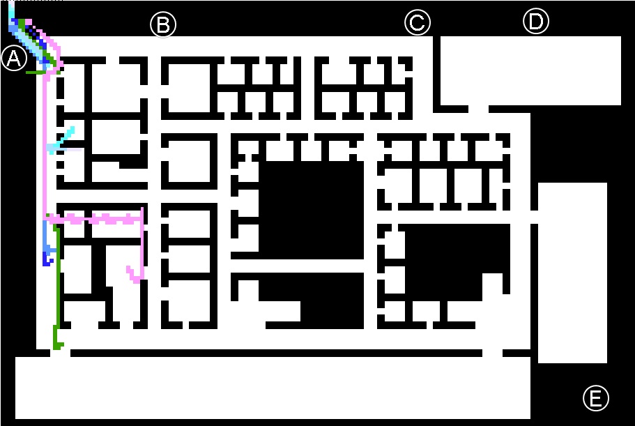
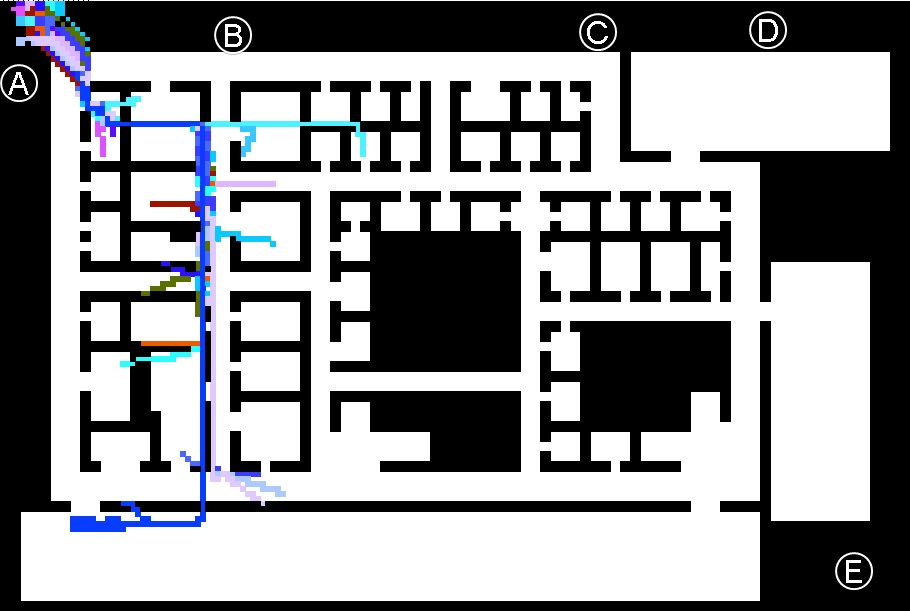
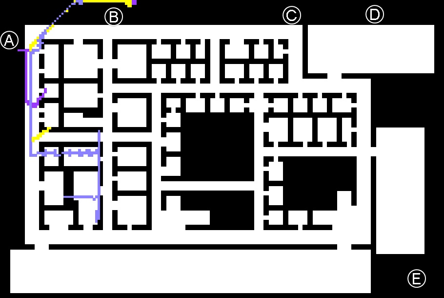
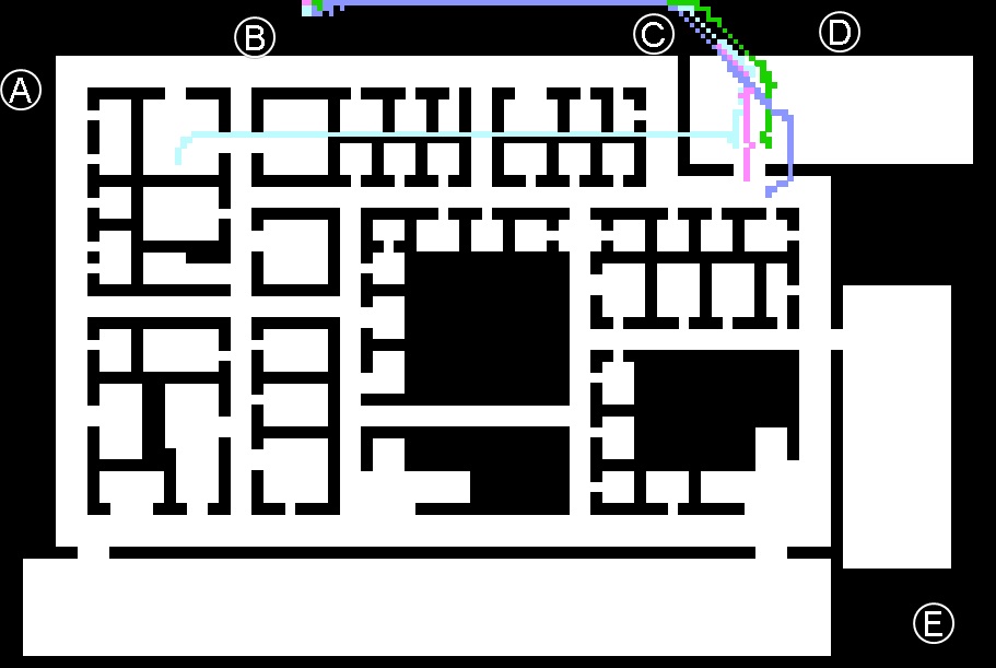
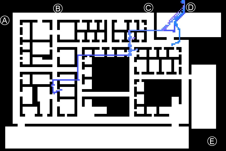
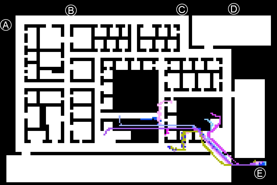
To see each evacuation path, isolated from the others, please click on Figures 3-9. Each figure boasts different views: a screencap of the relevant RFID travel paths, this same screencap with explanatory arrows, an extreme zoom view of the screencap, and a video screencap of RFID travel paths over the whole time period. Please use each screencap's right-hand legend to navigate.
|
|
|
|||||||||||||||
|
|
|
|||||||||||||||
|
As illustrated by these screenshots, it is clear that people in the building, who successfully exited, generally took one of these evacuation paths. They typically took whichever path was closest to them at the time of the explosion, following that path to its logical exit point.
In addition to the successful evacuations discussed above, our run-throughs of each individual’s movements over the time period showed us a number of individuals who do not successfully leave the building. Some are still moving around at the end of the time, suggesting that they have not yet found a lucrative exit opportunity, but that they are still alive. Others have stopped moving (or have not moved since the explosion); these casualties are discussed further in Traces-4.
The table below (Table 1) offers a characterization of the evacuation situation, with successful and non-successful evacuations.
Table 1. Characterization of evacuation process
| Groupings | ||||||||||
| People who exit | People who don’t exit | |||||||||
| Path A1 | Path A2 | Path B1 | Path B2 | Path C | Path D | Path E | Casualties | Non-casualties | ||
| RFID tags | 4, 22, 23, 33, 48, 67, 70, 75 | 6, 7, 10, 11, 14, 35, 41, 43, 46, 52, 54, 57, 61, 62, 68, 77 | 0, 49, 74 | 5, 8, 9, 12, 13, 15, 25, 26, 31, 34, 40, 42, 45, 53, 55, 63, 64, 66, 71, 72, 79 | 2, 16, 44, 81 | 17, 27, 29, 38 | 3, 20, 24, 30, 32, 37, 51, 58, 73, 80 | 1, 18, 19, 21, 28, 36, 47, 50, 56, 60, 65, 69, 76, 78 | 39, 59 | |
| Number of RFID tags | 8 | 16 | 3 | 21 | 4 | 4 | 10 | 14 | 2 | |
| Percentage of total people in the bldg. | 9.76 | 19.51 | 3.66 | 25.61 | 4.88 | 4.88 | 12.20 | 17.07 | 2.44 | |
| Percentage of total people who exited | 12.12 | 24.24 | 4.55 | 31.82 | 6.06 | 6.06 | 15.15 | - | - | |