Short Answer:
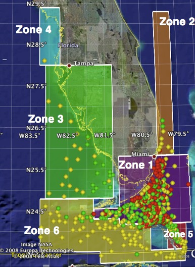
For this question, we again determined geographic “zones” to allow us to see and describe patterns and the evolution of interdictions over time (see Figure 1 for these zones and all interdiction data points). Note: these zones roughly correspond to those of our landing zones, for comparison potential (Boats-1 detailed answer). These zones, visually created with Google Earth’s “polygon” feature, can be “turned on and off” in our Google Earth set-up, like the layers of yearly interdiction data KML files and the island KML file (see Boats-1 detailed answer for the creation process of interdiction KML files).
This Google Earth set-up shows broad expansion of interdiction incidents over three years. In the screencap provided (Figure 1), it is quite evident: red circles are 2005 interdictions, green are 2006, and yellow are 2007.
One of our many Excel charts made this expansion—and its geographic and temporal characteristics—clear (Figure 2).
Figure 1. Our interdiction zones and incidents
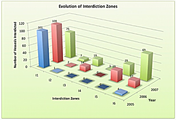
Figure 2. Interdictions by geographic zone and year