Detailed Answer:
For this challenge, we used tools from Google (Google Earth and Google Docs) and from Microsoft (Excel and Windows Movie Maker). Excel and Google Docs were primarily used to convert the data to necessary formats, while Google Earth, Windows Movie Maker, and Excel served chiefly as our visualization tools. Excel (again) and Google Earth were our strongest analytic tools for this mini-challenge. In short, we used a “budget visual analytics” methodology for this challenge.
Methodology:
Create Excel file on Google Docs
Our first step was to take the XML file, containing Coast Guard reports of individual encounters with migrant boats and related data, and import it into an Excel spreadsheet. This allowed us more freedom to sort the data as desired (e.g., by boat type, by year of encounter, by whether the boat landed or was interdicted, etc.). After moving to this layout, we converted each of the encounter coordinates to the standard latitude/longitude format. We then took our Excel file and uploaded it to Google Docs, in preparation for our next step. Additionally, we organized the data by year (2005, 2005, or 2007) and by encounter type (landing or interdiction), yielding six categories.
Generate KML files
Using a template provided by a Google Earth Outreach Tutorial on creating KML from spreadsheets, we input the latitude and longitude coordinates of each interdiction and each landing. While we created separate templates for each year-by-encounter type (e.g., 2005 Interdictions), the template we used only allowed up to 100 entries per spreadsheet, so we often had to create several spreadsheets to cover all of the datapoints in each of our six categories.
As per the Tutorial’s instructions, we “published” our modified template, then copied/pasted the resulting code into a text file and saved it with a KML extension. These KML files could easily be opened in Google Earth.
Examine in Google Earth
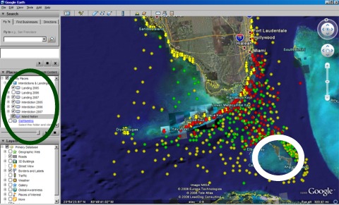
In Google Earth, we were able to visualize the interdiction and landings by year. We set Google Earth to show Isla Del Sueño, then put in six category folders, uploading our KML files into their appropriate location. To differentiate between our six categories, we assigned different map symbols to each: 2005 data was red, 2006 green, and 2007 yellow; landings were arrows and interdictions circles. In Google Earth, we could “turn on or off” any of these categories (limiting the data on the map to only what data we needed to examine) and could change the layering order for any categories. This set-up is illustrated by Figure 1, which shows all three years of interdictions and the 2006 landings (controlled by the panel on the left, circled in green) and Isla Del Sueño (also controlled by the left panel, but the island is circled in white in Figure 1).
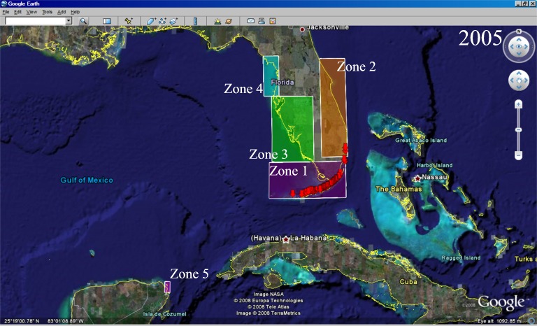
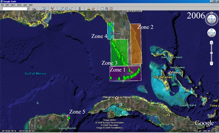
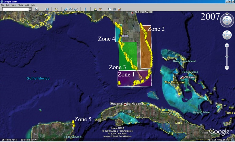
Furthermore, we broke the map into five “zones” (see Figure 2), which allowed us to more easily characterize the geographic evolution of the landing sites over time. These zones could be added to the Google Earth program using the polygon feature.
Figure 1. Our layered Google Earth set-up
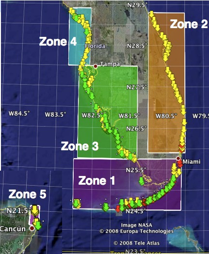
Figure 2. Our five-zone system
Generate visualizations; Develop conclusions
Google Earth was already a strong visualization tool; with our added KML files (landing points, interdiction points, and zones), we were able to manipulate what data points were visible, zoom in or out to see details of landing clusters, and add or remove our colored geographic zones.
In addition to this dynamic map, we created a slideshow movie with Windows Movie Maker (Figure 3 links to this clip). This shows the evolution of landings over time, without needing manual manipulation (as our Google Earth system with added KML files does).
Figure 3. Video clip of landing evolution, 2005-2007
Finally, we used Excel to create a variety of graphs from the data. These graphs (two of which are presented in Table 1) helped us examine the numeric data that could not easily be seen with mass groupings of circles and arrows on our Google Earth set-up.
With these visualizations, we were able to characterize the landing sites from 2005 to 2007:
Table 1. Characterizations of landings, 2005-2007
|
2005 |
2006 |
2007 |
Zones with landings |
1, 2 (barely) |
1, 3, 4, 5 |
1, 2, 3, 4, 5 |
|
|
|
General observations |
All landings along the southern coast of Florida; many on the Florida Keys |
Landings continue to occur along southern coastline; landings expand up the western coastline of Florida, further north than Tampa; the first landings in Mexico (near Cancún) occur |
Landings continue along the southern and western coastline, with greater frequency than previous years; landings notably expand up the eastern coastline of Florida, further north than Orlando; landings continue in Mexico, but do not expand much in geography there |
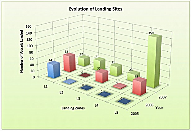
Number of vessels per landing zone |
Figure 4. Number of vessels per landing zone, by year |
||
Essentially limited to zone 1 |
Zone 1 increases slightly, but zones 3 and 5 become nearly as popular |
All zones are roughly equally popular, with the exception of the massively popular near-Cancún destination (note: the smallest landing zone)… This landing density is not as evident on the map, due to the landing site’s small surface area, so this Excel chart illustrates Mexico’s popularity |
|
Landings vs. interdictions |
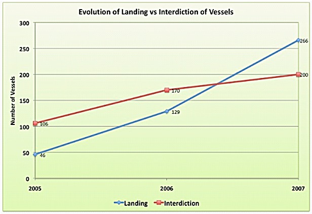
Figure 5. Landing vs. interdiction incidents, by year |
||
There were more interdictions (approx. twice as many) than landings. |
Both landings and interdictions increased at about the same rate; interdictions remain a higher proportion of the incident reports than landings. |
Interdictions rose slightly, but not significantly. Notably, the number of landings shot up and passed the number of interdictions. In light of the last entry (number of vessels per zone every year), this is interesting to consider given the zone 5 (Mexico) landing jump. |
|
Between the visual, interactive (zoom in/out, add/remove features and landmarks) Google Earth set-up and our numeric-based Excel charts, we visualized our data. This “budget visual analytics” method allowed us to characterize the landing sites’ evolution.